App
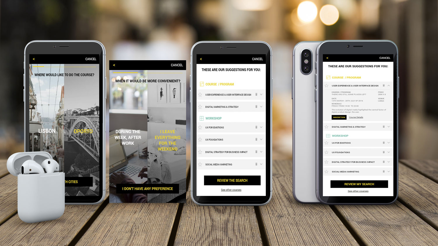
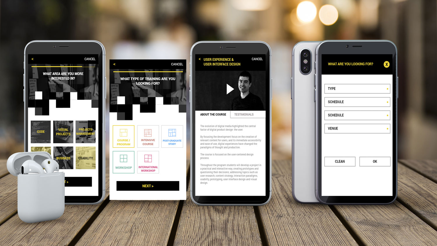
We maintained the client’s visual identity. Here are some mock-up screens from the final design.
Personas
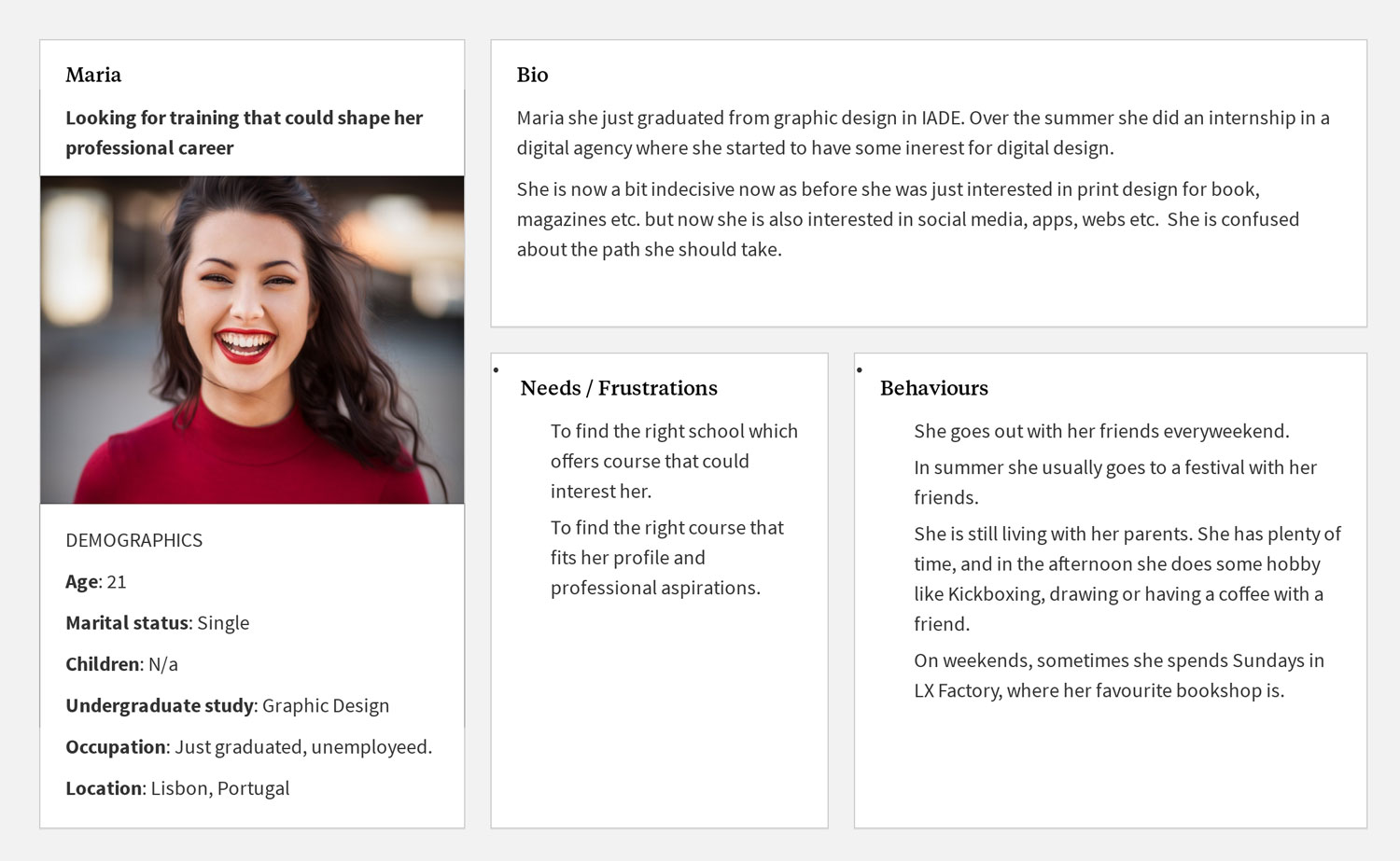
We created 2 personas based on our own insights and experience:
- Professional profile: someone in their 30s who wants to gain a new skill or switch careers.
- Recently graduated student profile: someone in their 20s who is looking for a specialization, and who may welcome some career choice advice.
Design / Prototyping & Usability Testing
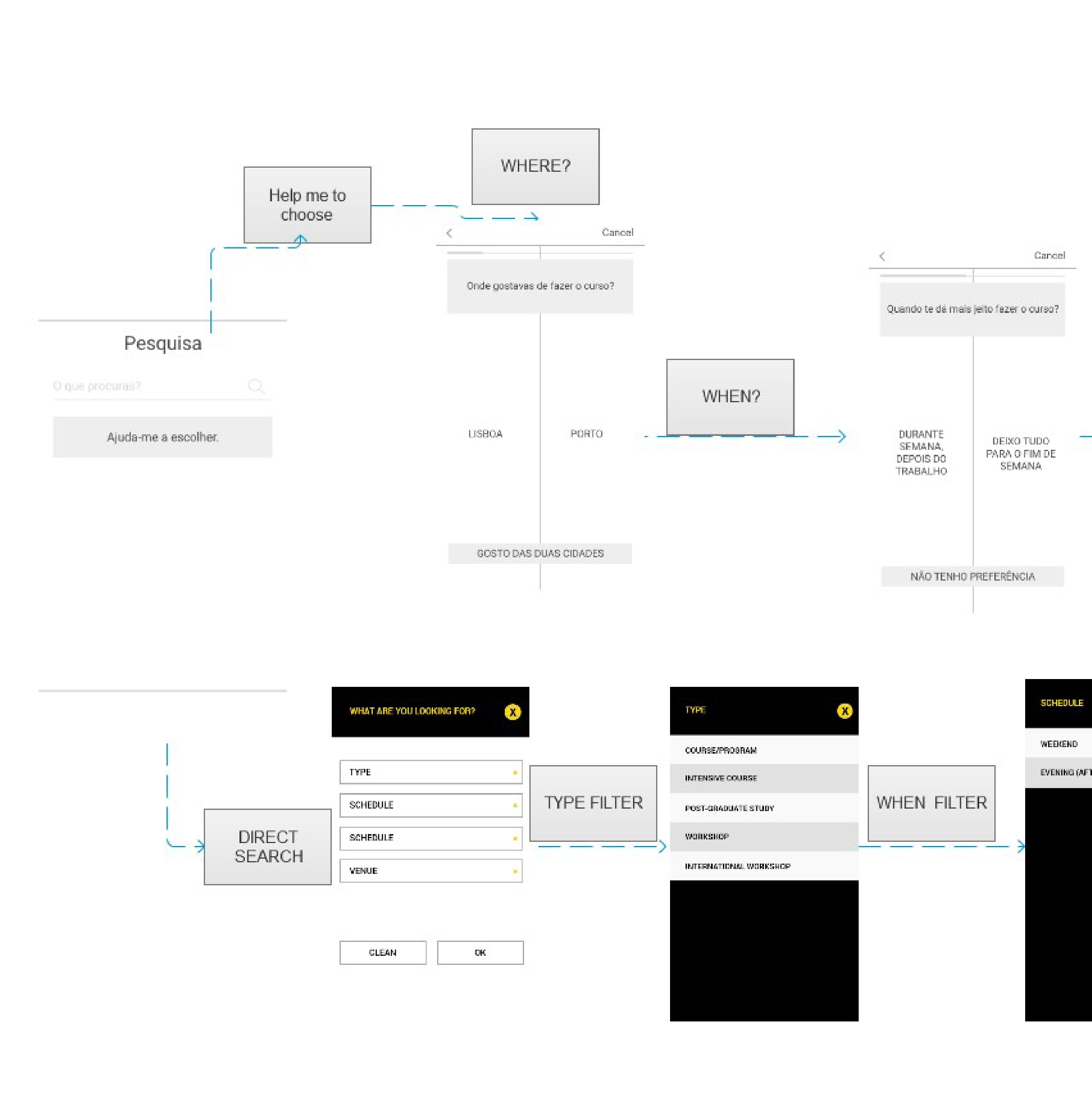
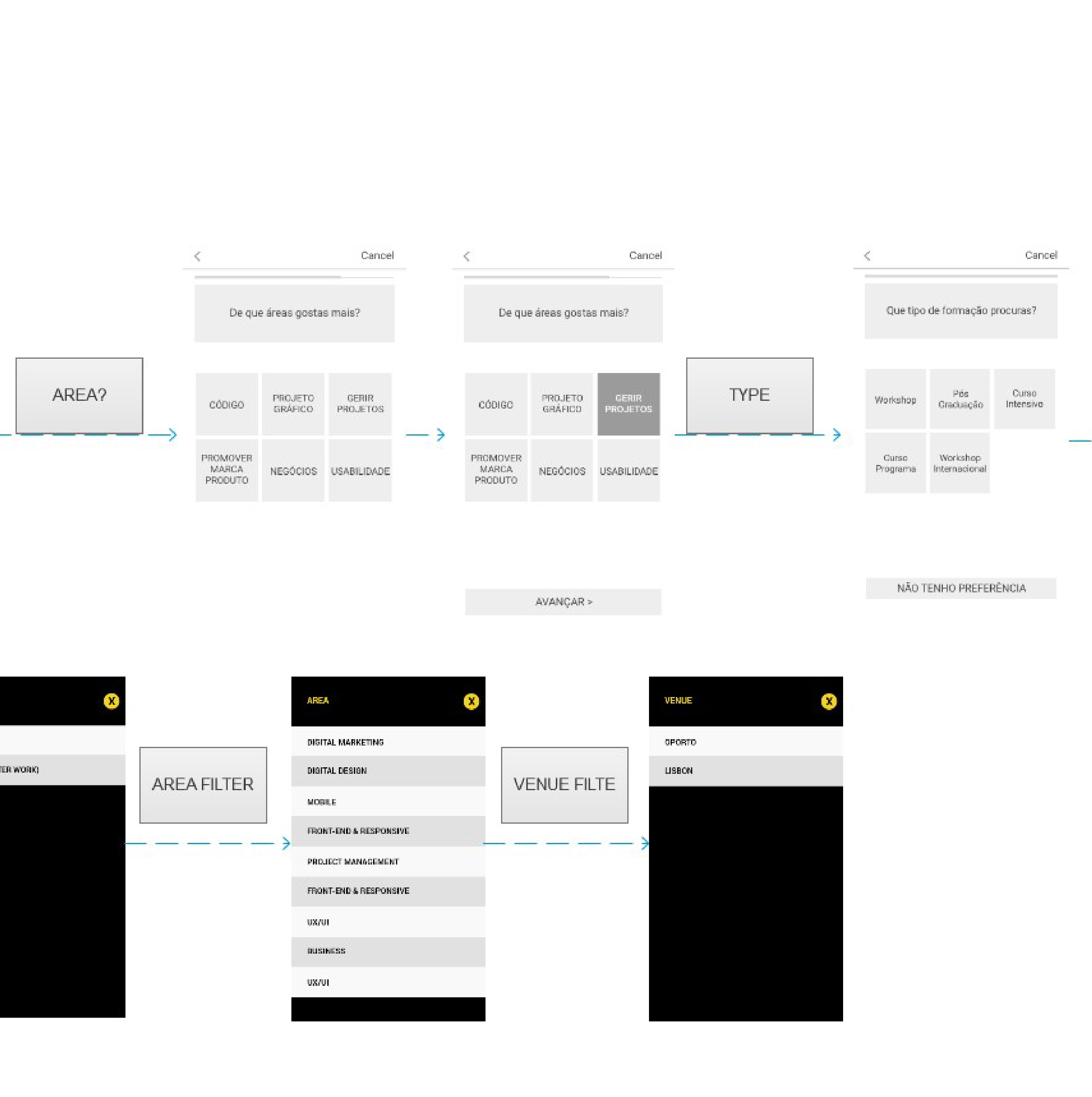
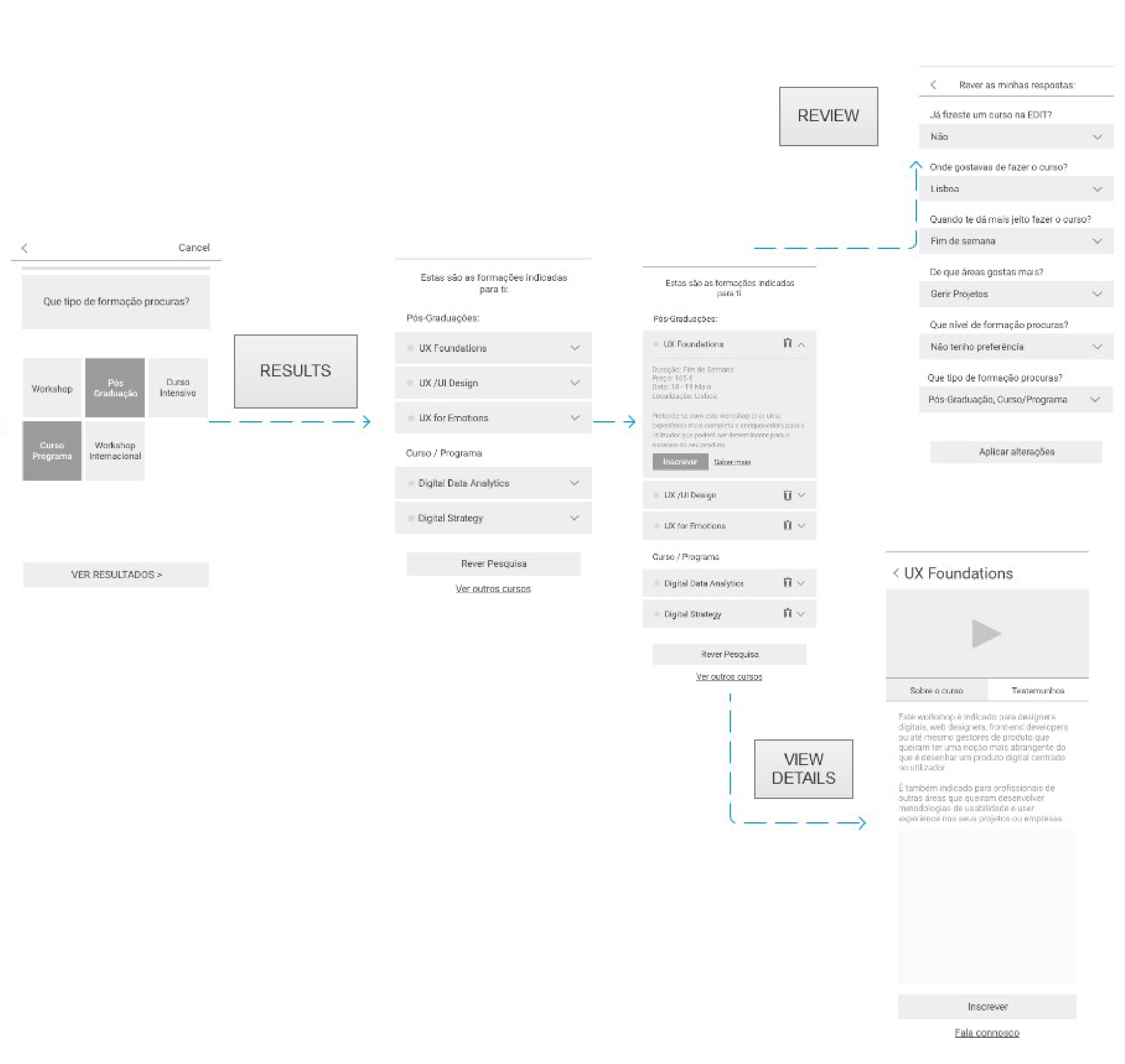
We worked mainly on using ‘gamification’ to humanize the course selection and the application flow.
The Persona we chose to focus on was the recently graduated student (‘Maria’) who is feeling a bit lost and indecisive and is looking for some guidance on choosing the right course.
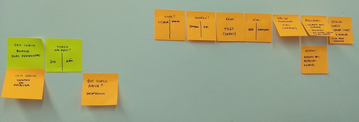
We went on to produce a Low-Fi paper prototype. After that, we tested it with possible users using Pop Marvel.
The feedback we got from our first test was the following:
- The flow was light and fast.
- The language used was pleasant and turns the process into a conversation.
- The first screen (‘do you know what you want: yes/no’) was regarded as confusing, and needed better copywriting.
- The circles didn’t match the visual identity of the brand, which are squares.
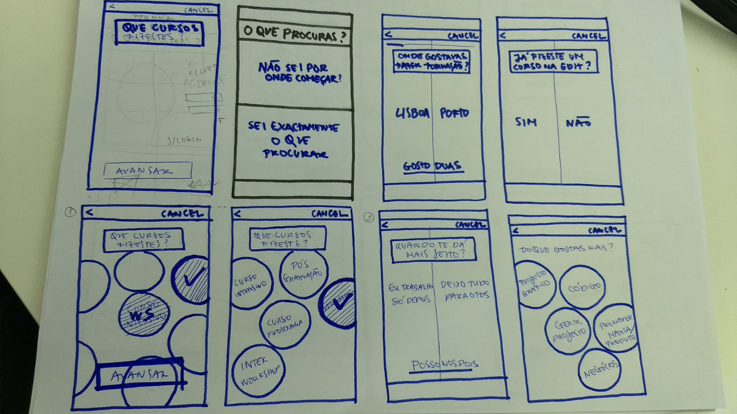
We used this feedback to improve our flow and wireframes.
We then tested the prototype before moving to the UI phase.
